

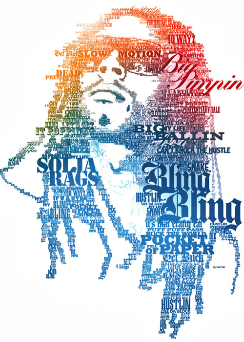
Good Example
· File name for good example:
goodtypography
· Source of example:
http://www.smashingapps.com/wp-content/uploads/2009/07/25-beautiful-examples-of-typography-portraits.jpg
· Elements of design exhibited:
It is a form of font typography. The maker of this typography Bob Marley did a wonderful job. The colors and word he used made the “Bob Marley Feeling” really come through the picture.
· Why you feel this item is effective:
It really shows the diversity of lines and words when you twist and turn them and look at them more than just letters Also his details are amazing because you know exactly who it is advertising. The colors also attract you to it.
· Who is the target audience?
I think this could be targeted towards just about anyone. Bob Marley or music fans mainly though.
Bad Example
· File name for bad example
badtypography
· Source of example:
http://onlycreative.com.au/images/blog-images/siscott-3.jpg
· File name for bad example
badtypography
· Source of example:
http://onlycreative.com.au/images/blog-images/siscott-3.jpg
· Elements of design exhibited (or not exhibited):
The use of color is great and really adds to the advertisement. I don’t like how the guy doesn’t have a head though. Also, you cannot clearly see the word Nike anywhere. You see the symbol on the shoulder of the jersey but they have all this typography and Nike isn’t even there.
· Why you feel this item is ineffective:
I feel like I don’t know what they are trying to get to. If the words and letters would have spelled out the words that they wanted you to associate with the advertisement it would have been better than just using regular everyday words.
· Who is the target audience?
Athletes, mainly foreign audience due to the language.
Good job with your images and reflection.
ReplyDelete